
This book was a very fun project I worked on with author Terri McEachern and illustrator Katie Wool. I met with Terri and we went through the illustrations that Katie had created. Terri needed me to do the following: One, clean up the pencil marks on the illustrations, move some pieces of the illustrations around to make room for text, type set the book, create a secondary message system and create a cover design.
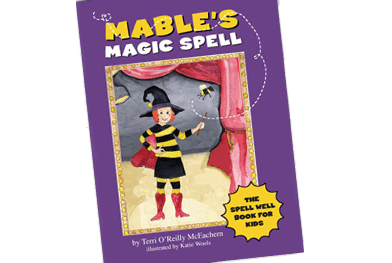
Here is the cover design I created:

I was very excited to get a mention in the book:

Below you can see how I used three different fonts for the book. One primary, one for secondary messaging and the other for signs. I also used two different colors – black and red. The red highlights spelling tricks.

I also added boxes and banners to the illustrations so the secondary tips did not fight with the primary story. In the photo below, the tips are in the frame on the wall and in the curved banner.

This layout was one of the toughest, since it had to convey so much information without disturbing the illustration. I created the boxes and the curved banner to set the type apart.

Have an idea for a book? Email me at [email protected] to set up a meeting to discuss it.