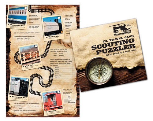
Is your brochure design up to par with your industry? Does your brochure design make you look like a professional? Does your brochure say “trust me” and you’ll be around next year to new clients? We only get one chance at a first impression, so make sure it tells your brand story at first glance.
In this digital age, more and more companies are relying on email, social media and websites to tell their company story. But there are certainly times when a company will still use brochures. Maybe it’s an in person one-on-one meeting or you are at a trade show or you want to tell people that visit your location about an upcoming event.
Let’s break down the most important elements to a brochure:
Original cover
One of the most important elements to any brochure is the cover. You only have a second to capture the interest of the passerby. Does it make you want to open it and find out more? Does it look professional, like you are the expert in your field? Does it contain brand elements that are consistent with your other materials?

Compelling content
Once you open the brochure, it’s important that you have compelling photos and content. Does the text make you want to find out more? Do the photos represent the beauty of your location? Is it age appropriate? Is your brochure typo free and grammatically correct? Does it tell your brand story?

A call to action
Every piece of marketing material should have a call to action, including your brochure. Just like when they visit your website and you direct them to sign up for your email newsletter, your brochure should likewise include a “call now” or “email for a free estimate.” Two methods I use for my company, include directing people to sign up for a free 7 week wine marketing email course with a QR code, plus for general email subscribers I offer a free workbook on how to build your brand.

Consistent branding
The 5 branding elements – logo, color scheme, fonts, tone of voice and images – should be consistent on all of your branding, including your brochures. This is especially important if there are multiple pages to your brochure. The same color scheme should be used throughout, as well the same font, style of photography and layout. For example, on the below Impex brochure, while the photos at the top change, the space it occupies is the same. You’ll also notice that the layout, fonts, color scheme and tone of voice also repeat.


Do you need a professionally designed brochure? Email Becca at [email protected] for a free estimate!
