Sukha Yoga recently moved into a new space in downtown Belleville, Illinois. With the new space owner Sarah Fraser wanted to get a custom logo designed and knew if she wanted her business to grow she would need to have a consistent brand. She wanted a logo that would look great in social media, plus perfect on her downtown storefront building.
To get a really good idea of what type of yoga being taught, I took one of her yoga classes and then met with her one-on-one afterwards.
The name Sukha means the “sweet space” that is inside everyone. Sarah requested logo designs with clean lines and a simple design. Plus she preferred to have an icon with text.
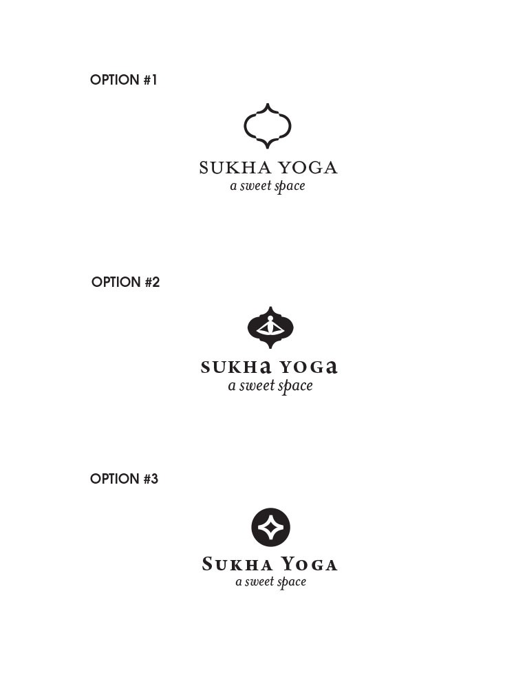
Below are the initial black and white logo design options that were presented:
The first two curvy shapes were inspired by the original tin ceiling in the yoga studio. In the yoga class I took, Sarah told us a story about how the curvy shape reminded a fellow yoga teacher of the story of the Hindu god, Hanuman, the mighty ape that aided Lord Rama in his expedition against evil forces.
Sarah also told me that one of her favorite Asana’s was called Sukhaasana, which is the cross legged illustration in Option #2.
The last yoga logo design was based on the concept of a very simplified sweet space.
Once Sarah chose Option #3, we then played around with different color options. The final yoga logo design that was chosen was:


