How do you create a lion that is fierce, yet contemplative and is the cornerstone of a future wine brand?
Owners of the Leonard wine brand reached out to me earlier this year to discuss creating a wine brand targeting consumers that regularly purchase $30 bottles of wine. This father and son duo live in two different states, but I was still able to meet in person with one in Sacramento, California while in town for the Unified Grape and Wine Symposium and the other at the Midwest Grape and Wine Conference, in St. Louis, Missouri.
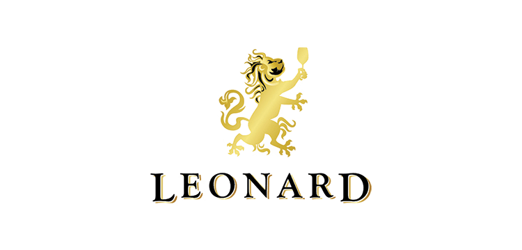
Next, I reviewed Leonard’s answers to the business strategy and design questionnaire I sent over. The client specifically requested “a bright gold rampant lion holding up a Bordeaux glass of wine that has a body that is detailed, angular, and fierce. For the face, the goal is to create a studious and contemplative look, as he looks up to study the contents of the glass of wine. Somehow combine the brawn of a fierce lion, with the brains to show restraint and examination.”
I spent hours researching and then went to work designing 3 logo options, each with a hand drawn lion and paired with classic serif typography. The type/font choice is a big decision when it comes to wine label design. Part of my process involves creating an entire page of the word “Leonard” in different typefaces and then choosing the type that best pairs with the target consumer. For example, a serif font communicates “we are a traditional wine” while a sans-serif gives the message “we are non-traditional or a modern wine.”
It was very important for the lion to be 100% original, since this lion will end up being the main focal point for the wine label. After several different hand drawn lion designs were presented, we ultimately ended up choosing this fierce yet contemplative one:
Next up, I am in the process of creating the Leonard wine label and their business cards.
What did Leonard think of working with me?
I have often found that the best description of how I work often comes from clients describing the process. Here is what Leonard had to say of working with me on the logo design:
We are a family originally from Missouri, now beginning a brand in the wine business. Our goal is to keep our product line and business model succinct, keeping communication fluid and close knit as we build this brand. After briefly working with a designer in CA, we noticed that our input for our brand was taken only with a grain of salt. We experienced a poor exchange of communication throughout those initial stages of development. As a family, we decided to end our relationship with this CA designer.
Going back to our roots in the Midwest, we found Bauerhaus Design and began working with Becca on our wine label, Leonard. Becca was happy to pick up where our first designer left off, and since the inception of our relationship with Becca, our brand development has only achieved greater progress as each exchange has taken place.
In creating our brand, Becca’s advice was to start with logo design. She has created a combination of image and family name for our logo. The presentation directly reflects our thoughts on wine and how we wish to be portrayed to the consumer. Since no one in our family is a designer, we could not have envisioned how the design would actually turn out on paper. The end result captures everything we could have imagined with Beccas personality and perception of tasteful design, intertwined. When you meet Becca you see she is fun. If you were to meet me you may see I am a bit dull. Our logo is serious, as requested, but with a great presence of personality thrown in by our designer.
Although it is important to discuss how pleased we are with the final logo designed by Becca, we would also like to share the importance of working with a designer who says, “yes, I can try this” or “yes, I can do this”. It is evident that this person’s attitude on brand development is to empower all of the ideas given by her client, while using her expertise to steer the client in the right direction. Unlike our first designer, Becca never told us “no, I won’t try this” during the logo design.
There are, in fact, many more positive comments to share about Becca’s work ethic and performance. In keeping with our brand identity of succinct and meaningful, we hope the meat and potatoes of Becca’s creativity and positivity has been transposed through this recommendation. We would like to officially thank you here, on paper Becca, and say how pleased we are to continue the design and branding process with you.
Chris & Tom Leonard