

Leonard Wine Company wanted to refresh their Muddy Arch wine brand. They loved the design, but wanted to know if they could make it pop more on the St. Louis supermarket and wine store shelves.
The original design included the below design with a dark night sky, white embossed currents and a clear hierarchy. You can read the full case study of the original development with Leonard Wine Company here.
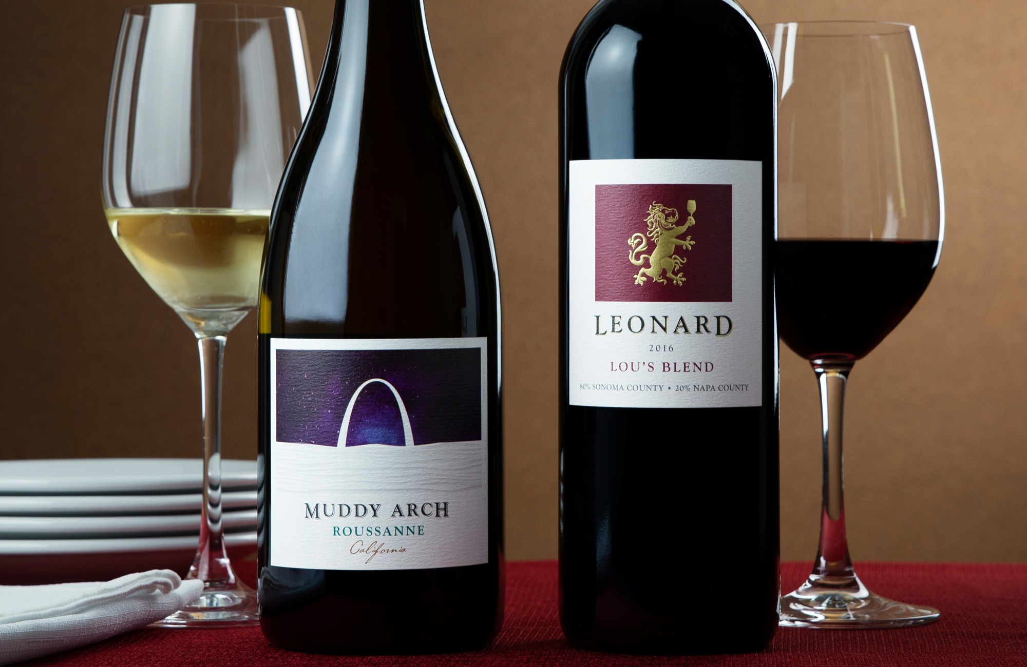
 At the second printing of these labels we added a few packaging elements to elevate the perceived value on the shelf.
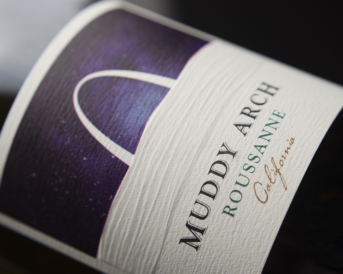
The Muddy Arch’s new label keeps the clear hierarchy and a thick paper, but adds silver foil for the stars in the night sky and a drop shadow on Muddy Arch.
Plus, we changed the night sky to be a brighter blue and gave it an illusion of depth by adding in different shades of blue.
This brand still uses a “naked” closure, which signifies a new trend to show they aren’t a stuffy wine brand. The wine label has an embossed river, so when you pick it up you can run your finger over the texture.
This helps the label to work better at three levels: it catches your attention, invites interest to pick it up and feel the river, and communicates their brand story.

