
Well-chosen words deserve well-chosen letters. No matter the method of design – print collateral, packaging or website design – the type you use greatly impacts the way people see your company and its brand. With a million different fonts out there, how on earth do you pick one for your business?
As Robert Bringhurst says in The Elements of Typographic Style, “Well-chosen words deserve well-chosen letters. The typographer’s one essential task is to interpret and communicate the text.” Is your type telling people you are worth the price you are asking for your product?
Think about it: Fonts are the handwriting for the modern age. With people handwriting less and less, fonts need to tell the story of your business.
Here are 4 general types of fonts:
- Serif: Serif fonts are most often seen as classical because they have been around for over 500 years. Serifs are what I call the handlebars at the end of fonts. Serif fonts are very easy to read when used for paragraphs and most books rely heavily on serif fonts.
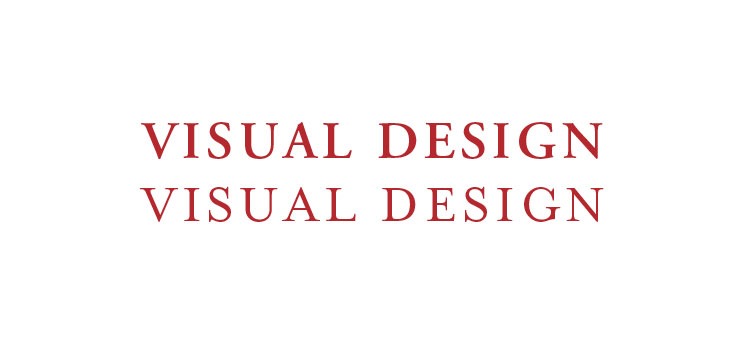
Common Serif fonts: Times New Roman, Adobe Garamond, Palatino and Mrs. Eaves
Font mood: Traditional, professional, classic, historical - Sans Serif:
Sans serifs, like Helvetica, debuted in the 19th Century and are most often viewed as Modern or Contempory fonts. Sans (translated = without) Serif fonts do not have the handlebars at the end. Serif fonts are used most often for headlines, but can also be used for paragraphs if the company is shooting for a modern message.
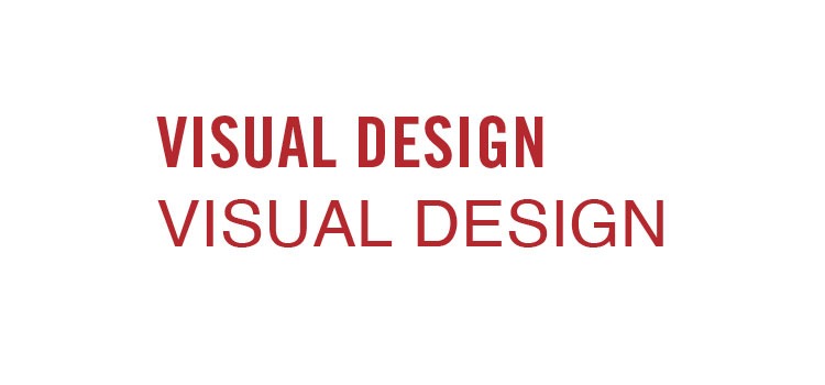
Common sans serif fonts: Arial, Helvetica, Futura and Franklin Gothic
Font mood: Can also be classic, plus modern, dependable, easy going, and friendly - Script:
There are two subsets. Most scripts are usually Formal or Casual. Script fonts should only be used for a logo design or a title.
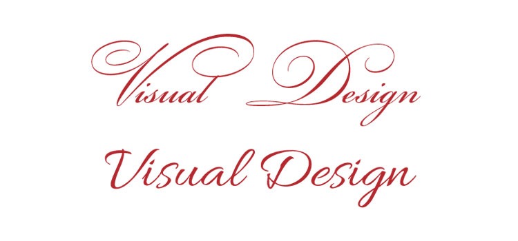
Common script fonts: Bickham Script Pro, Spring, Bickham
Font mood: A formal script can portray elegance and look expensive while a handwritten script can tell the reader I’m fun and artistic. - Display/Decorative:
These fonts are most often used in logo designs or short headlines, because when used as a paragraph text they become very hard to read.
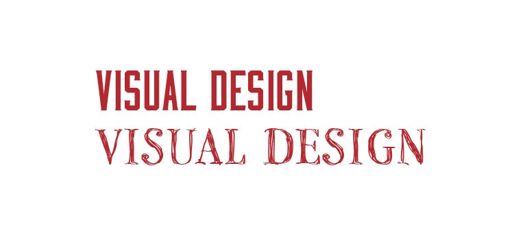
Common Display fonts: Impact, Mesquite, ITC Beesknees
Font mood: These fonts have a very strong personality and can communicate everything from surprise, futuristic, to childish and dynamic.
Pick a maximum of two fonts for your logo and maximum of three type families when creating branding collateral, like brochures, wine labels and website designs. Once the three font families are created, stick with them. Using more fonts than three may confuse the reader, make your brand less memorable and limit their time reading.