
In 2022, your presence online is more important than ever.
Especially in the wine or food industries: competition is fierce.
Consumers have high expectations for you to earn their dollars:
- They want to be entertained
- They want to feel connected to your story or cause
- They appreciate uniqueness and eccentricities
- Most importantly, they want it to be easy
We’ve put together a list of the top 5 web design trends you need to know for 2022.
1. Branding first
Your business should have a strong persona. That’s how you:
- Become recognizable
- Attract the right clients
- Stand out from your competition
- Win brand loyalty
You know why you need good branding, you can learn more about how to have a good branding strategy, but what parts of design actually create branding?
First things first, your website needs to capture your brand and purpose immediately.
92% of consumers report looking at a website at least once before making a decision. Nearly 55% report checking a website over 4 times. You need to stand out and make immediate connections with the viewer.
Make your brand easily identifiable right when people land on your homepage:
- Have a clear, easy to see logo that matches your product
- Create a strategic headline so your viewer knows exactly how you’ll help them
- Make sure your photos match and make sense
- Ensure consistency between your copy (wording), colors, design across your packaging, website, social media presence, etc.

Bauerhaus Design for Zion Lutheran Church, strategic headline example
2. Create a path
Your website is an excellent way to capture a new customer. But the least interesting – and least effective – way to do that is to have a bunch of information and little direction on what to do next.
To have an effective website you need to create a path that guides your prospect through curiosity, education, objection handling, call to action, and an easy way to place an order and pay.
Your design should make the page nice to look at and be easy to read but focus on what you want the prospect to learn and do next.
Some examples:
- Make sure your website is intuitive and easy to navigate
- Have a bright, bold, or otherwise eye-catching strategic headline they can’t miss
- Use white space smartly to guide the eye where you want them to look next
- Feature good reviews on the homepage
- Have a clear call to action (buttons are popular and stand out, use a contrasting color)
- Make it clear how they place an order and how easy it is to pay (logos of payment methods you accept, etc.)
Ultimately, you need to take into account the questions your prospects will have and make it easy for them to find the answers. From getting to your website in the first place, to easy navigation once they’re there, you need to make it effortless to know who you are, what you’re about, and why they need your product now (in a genuinely informative, non-sleazy way).
To help our clients do this, we use the Bauerhaus Brand Map. Our proven process digs in deep on your brand and target audience to make a custom plan that leads to sales.
3. Mobile-friendly is a must
More than half of the websites we’ve built show that more people view the site on their phones than on their desktop according to Google Analytics data.
And it’s not just our clients. This trend is seen throughout internet usage worldwide.
What does that mean for your business exactly?
Your website must be “responsive” meaning it adapts depending on whether the user is coming from a desktop or mobile device.
You can probably recall clicking on a website only to find the text looks like it’s size 2, and you’re trying to zoom in and see what it says. But your thumbs are in the way, and the words are off the screen. You probably gave up and found another site that was easier to use.
Don’t let this be your prospects’ experience.
We recommend and create all of our website designs with the mobile user in mind. This includes taking into account how easy the user can see your copy and photos, but also the experience of clicking on or navigating your site. Check out examples from our client, Zion Lutheran Church.


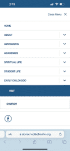
Bauerhaus Design for Zion Lutheran Church, mobile-friendly website example
4. Typography: pass the vibe check
Like we mentioned earlier, consumers are expecting more out of brands than ever.
They don’t want just a good product. They want an experience.
This includes the typography on your website, in your social media posts, on your logo, and even labels on your bottles or boxes. Although it can be tempting to look over, this extra step:
- Builds brand awareness
- Makes it easier to quickly recognize your posts or products
- Feels special and unique which gives your customer a positive experience and sentiment
Your typography creates the mood of your brand and even the type of customer you attract. This isn’t new, think back to the sans serif vs serif debate. In fact, some brands are even going back to serif to give off a sophisticated, upscale vibe.
Make sure your typography matches your brand and sets the right tone.
5. Clean design
Your design should be clear and help your customer to have a better experience with your brand.
You want them to leave your website- or throw away a bottle after using the last drop- with a strong sense of who you are. You don’t want them thinking ooh that was so good or I really liked that blog, but I can’t remember where I found it.
Your design should make an impact, make sense with your target audience, and be unforgettable.
Like the typography, your overall design sets up the tone of your brand and the experience your customer has with it. Consciously choose colors, patterns, fonts, sizing, white space, etc. to convey your brand identity and appeal to your target audience rather than adding something that just looks pretty or is popular (but serves no purpose).
If you’d like help creating a design that converts, set up a free 30 discovery call with Rebecca today.