
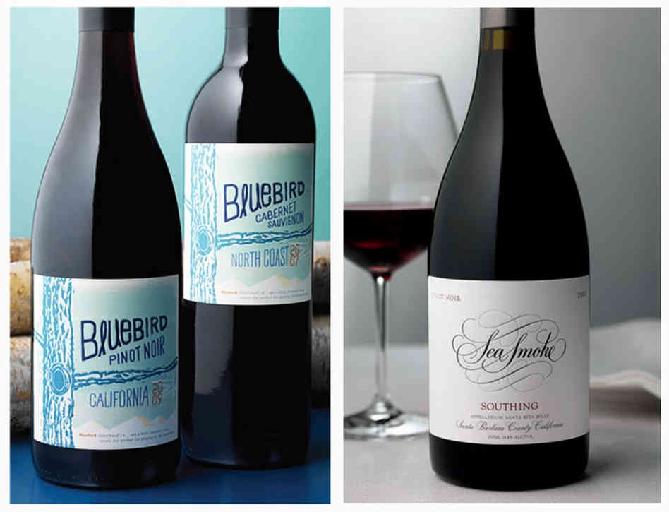
When I give presentations on wine label design and wine branding, I often show the above photo and ask “which wine costs more?” In other words, “which wine is of higher quality?” It’s impossible to know the quality or taste of the wine by staring at the photo, but at EVERY conference I have presented EVERYONE says, “the wine on the right.”
Think about this fact: Our senses take in about 11 million bits of information every second, but we are only consciously aware of about 40 bits of that information.
This means that our brains are often taking shortcuts when it comes to packaging design. For example, how many times do you really notice all the details on a wine label? Unless you are a wine label designer, like I am, I doubt you are consciously noticing each font on the label, the paper type, Pantone colors, foil, and embossing that were used.
Instead you glance at a wine label and unconsciously think: poor label design = poor wine quality. Professional wine label design = high quality wine.
What are these visual cues that we unconsciously see? In the above example your brain is noticing the subtle differences – hand drawn rustic fonts vs. the more elegant calligraphy & serif fonts. Non-traditional design vs. very traditional hierarchy and comes to the conclusion the wine on the right is more expensive.
While the design greatly depends on who you are targeting and your brand story, the most expensive traditional wine label designs often show similar patterns.
Typography
Traditional wine label design most often uses serif and script fonts. Modern or Millennial targeted wine label design often uses sans serif or hand drawn type.
Texture
One over looked piece in wine label design for small wineries is often the paper choice. Textured paper signals to us that this wine is high quality. Think of all the adjectives you use to describe your wine and pick paper that mimics those adjectives.
Color
Deep wine colors or jewel tones are often used for high end wine labels, while brighter colors signal this wine is at a cheaper price point.
White space
The more white space (also called negative space) you have, the more your consumer will assume this is a higher quality wine.
Details
Our brains pick up subtle details like the beautiful embossing (raised swashes) below that tell us that certain wines are more expensive. Other visual details we register are foil stamping, custom logo design (another words not clip art) as well as custom illustration or artwork. These details communicate this wine is high quality.

How do you know what color, texture, etc to pick? Know which of the 6 wine drinkers you are targeting and have an unforgettable brand story. Also, make sure you pick a designer that partners with you and can help guide you based on your target market and wine price.
Rebecca is the owner of Bauerhaus Design, which specializes in building brands for wineries. Take our free 7 week wine marketing class to learn how to sell more wine with a powerful brand, email marketing, social media, online ads and more: sell-more-wine