What happens when Baby Boomers and Millennials come together to create a wine brand? KC Wineworks just opened in the Crossroads Arts district of Kansas City, Missouri, and a few brand elements from our recent collaboration are highlighted below.
If you were at the Annual Texas Wine & Grape Growers Association conference in February and saw my presentation “Case Study: How Six Brands Target Six Different Wine Consumers” this may sound familiar to you!
Logo
We created KC Wineworks logo as two separate pieces that can be combined in various ways. The gear represents the modern focused Millennials and how their winery is in an urban setting. We played with several different type styles and ultimately went with a more classic serif font with a swash that is very typical of a font that appeals to Baby Boomers.
Wine label design
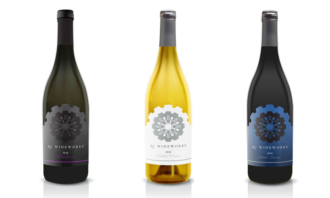
For this design we again focused on balancing the two different age groups. This label has a very unique gear die-cut that shows off the cutting edge Millennial winemaker. Since this design has lots of edges, we worked together with the printer to make sure that the label could easily be printed and applied to the bottle. We adjusted the initial gear teeth to be a little rounder in the process. The Baby Boomer part of the label comes with the layout. The layout is a very traditional layout with an illustration as the main eye candy and the rest of the wine information in a easy to process hierarchy.
Cider label design
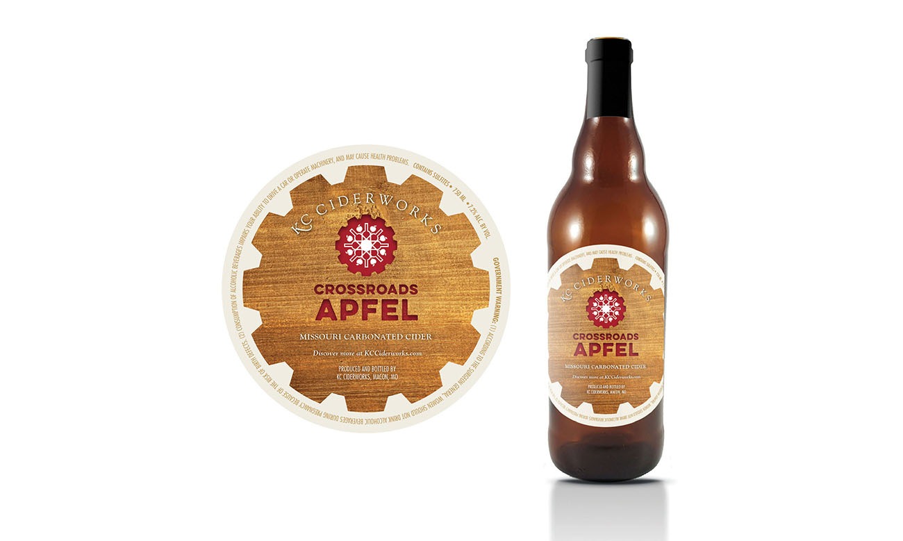
This label was a little more of a challenge, because the client requested that it not have a back label. This meant that all the TTB information needed to go on the front, too. We had to strike a balance between making sure you first read “Crossroads Apfel” but still able to read the government warnings. Since ciders are mostly consumed by younger generation, we used a sans serif font for the “Crossroads Apfel” and added a fun wood texture.
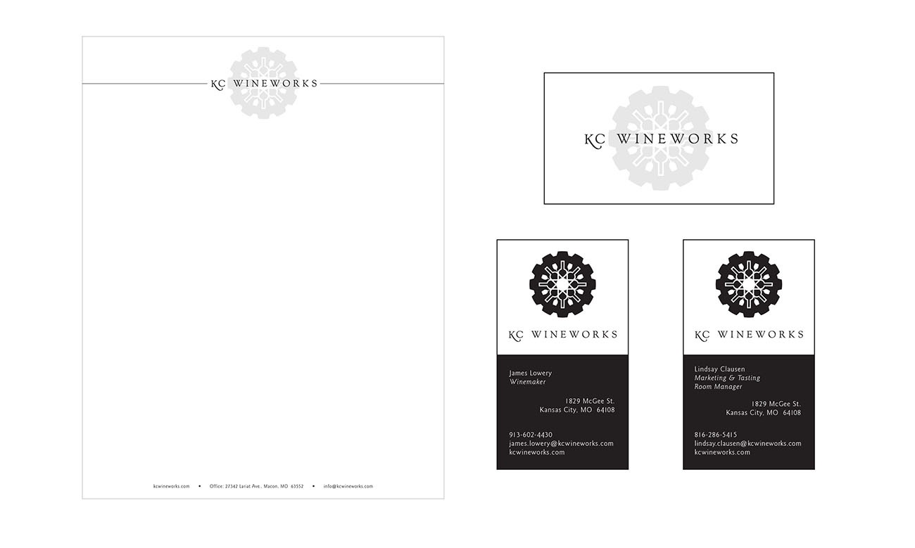
Plus, letterhead and business card design:
Click here to see the KC Wineworks website design and development case study.


