
How can your wine label stand out from other wine brands both in the tasting and store shelves? Packaging design is made up of many elements. How do you decide which to include on your wine label design?
In our first blog in this series, “Why is wine label design so important?” we talked about how our brains make decisions in milliseconds. This is why wine label design is so essential in promoting your wine.
While some shoppers are choosing wine by price or grape varieties, many are also choosing wines and wineries they want to visit by if a wine package is aesthetically pleasing.
Let’s first consider a journey to a wine store or big brand store. How does the typical consumers shop at a retail store? Your label should work like this when placed next to your competitors:
- From a distance – when you see the label across the aisle or at your tasting room, you are drawn to the label.
- At arm’s length – The wine label should be clear, simple and have a hierarchy of key information.
- At home – while drinking the wine, you might notice another label dimension you didn’t see at first or even explore the back label in more detail.
What elements make a label unforgettable?
In a Texas Wine Marketing Research Institute and Rawls College of Business at Texas Tech University study from 1991-2006 there was an “Unmistakable trend: the better the recognition rating a wine brand received, the more likely it was to survive. No such link existed between quality evaluations and a brand’s success.”
This means that even if your wine is perfect and everyone says amazing things about it, if the packaging is forgettable people are not going to remember it.
While the design greatly depends on who you are targeting and your brand story, higher priced wine label designs do often show similar patterns.
Have a clear Hierarchy
Many wine drinkers shop by wine varietal. They know they like Chambourcin or Zinfandel, but are looking for a new brand to try. Your brand logo and name should be the most memorable. Second in line should be the varietal in a font that is easy to read and if important to your brand – the wine region or AVA.
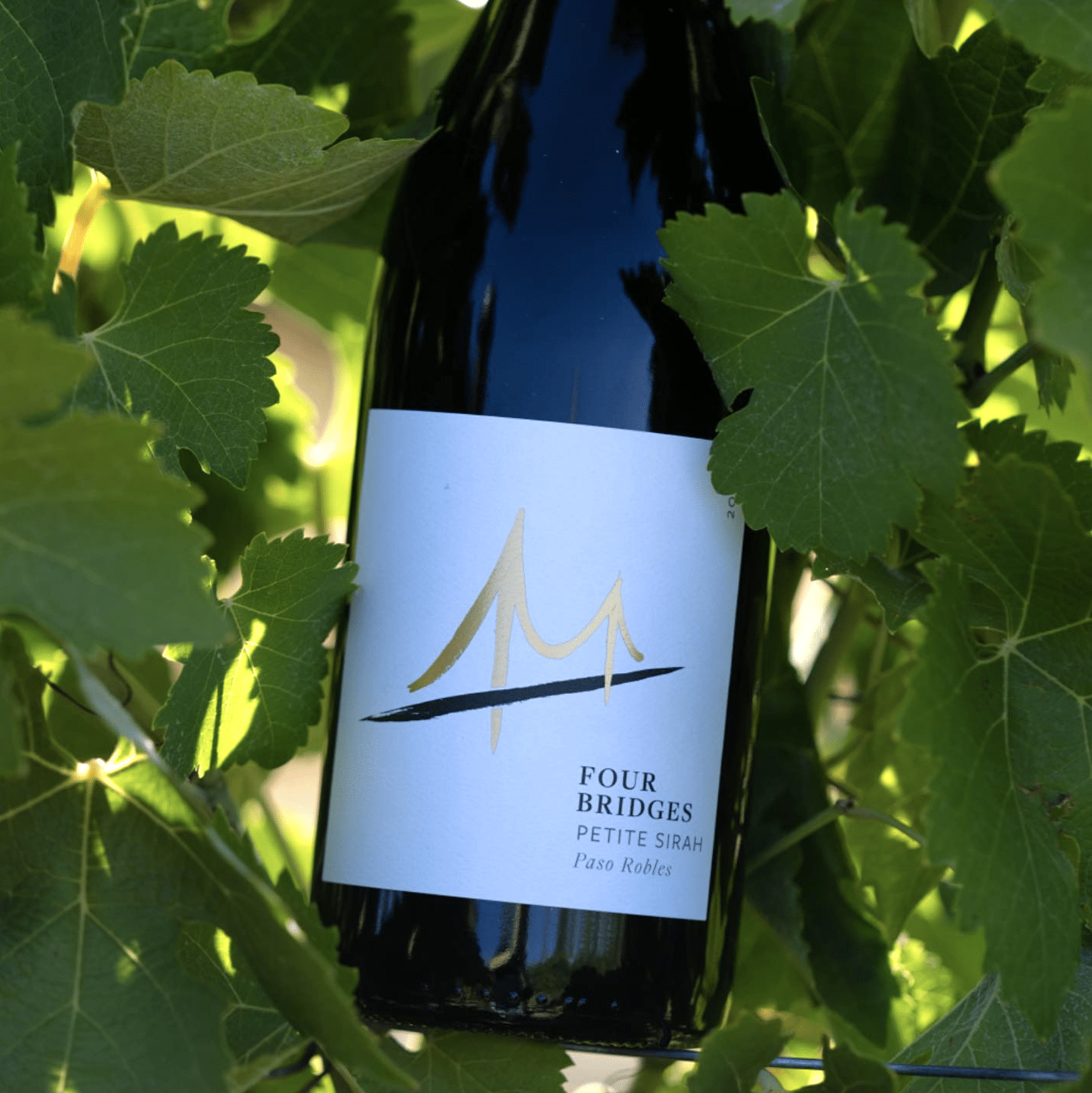
Logo design
Having an unforgettable logo makes your brand identifiable anywhere you are: retail shelves, tasting rooms, festivals, etc. It’s important that whatever style your logo is, that it is both readable and easy to remember.
In marketing, there is often a rule of thumb that one has to see a product at least 7 times before they purchase. If you make your logo a unique icon it do the marketing work for you. Read more about the Bingham Family Vineyards case study here.

Paper:
One over looked piece in wine label design for small wineries is often the paper choice. I’ve seen many wineries cut corners here and it shows. Especially when they submerge their white wines in a bucket of ice and the paper peels.
This can be easily solved by talking to your printer about using a higher quality paper. One of our clients, KC Wineworks, took each type of possible wine label paper and did an ice bucket test. Every hour they pulled the wine bottle out and took photos of the different labels. Great idea!
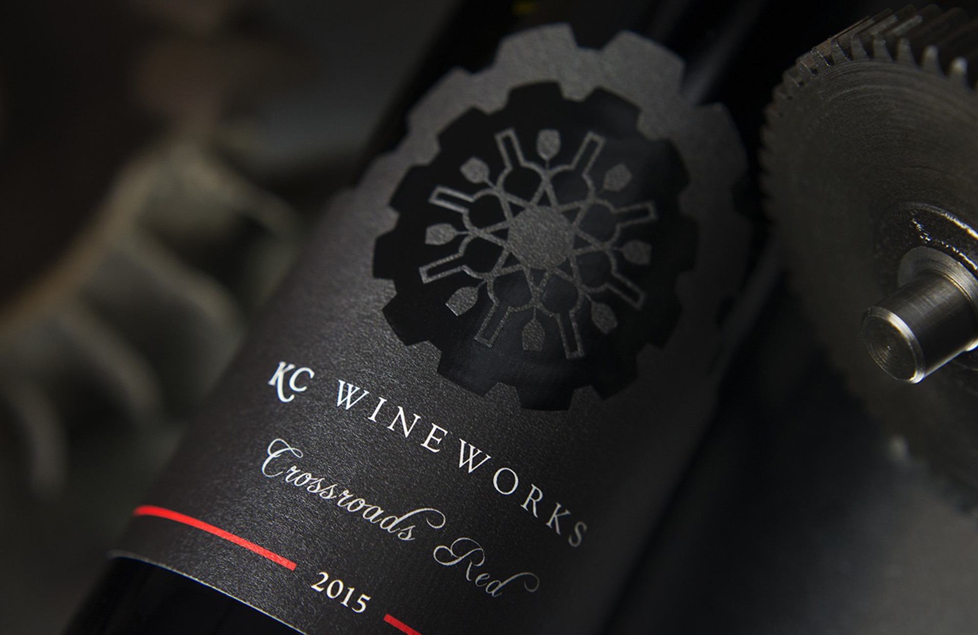 Thicker textured paper signals to the eye of the beholder that this wine is high quality. When choosing what paper to use for labels we often work with our client’s printers. Printers have a wealth of knowledge and a phone call with the final designs can elevate the brand.
Plus, paper is also important on how it feels. When a consumer is drawn to a label design, they often pick up the bottle and run their finger over the paper. Does it feel like expensive stationary? Or does it feel like copy paper that someone did a DIY project with?
Color
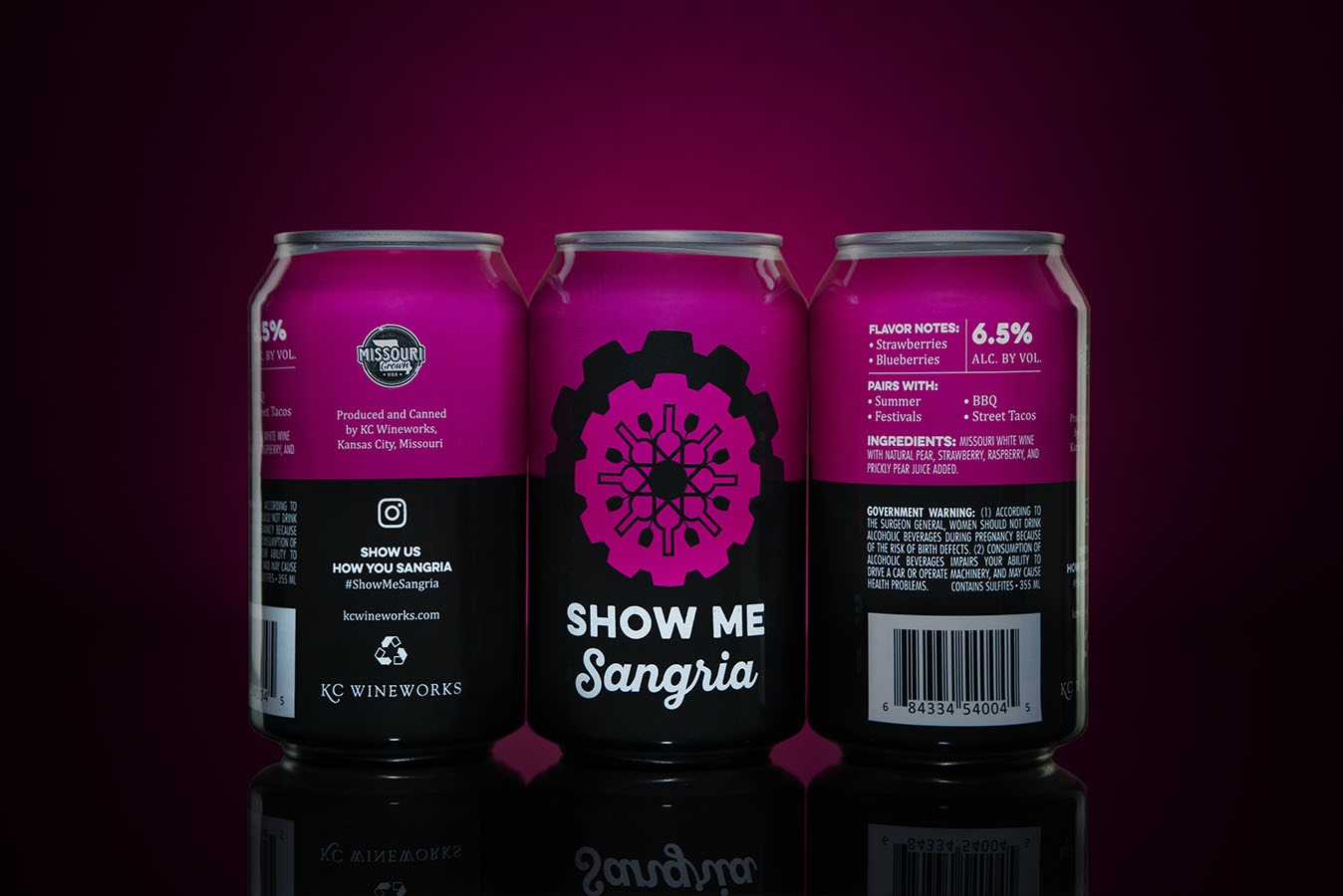 Who you are targeting can make a huge difference on what colors you use in your wine packaging. What appeals to a young Millennial will not appeal to a 65+ wine drinker. In general, higher priced wines often have just a pop of jewel toned color and lower priced wines are often more colorful.
The more white space (also called negative space) you have, the more your older consumer will assume this is a higher quality wine. This is why it is so important to research what different colors mean to your audience and then to use colors that will appeal to them.
For example, the above KC Wineworks cans we designed are a completely different audience and price point than the $200 Sake brand Seven we designed.

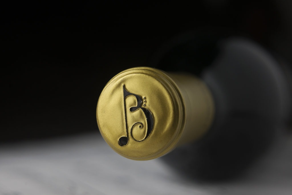
Finishes
Our brains pick up subtle details like the beautiful embossing that tell us that certain wines are more expensive. Other visual details that increase perceived value are foil stamping, debossing, glossy finish, matte finish, die-cutting, and varnish.
How do you know what finish to pick? Make sure you pick a designer that partners with you and can help guide you based on your target market and wine price.
Closure
We also work with clients on what type of closure they plan on choosing. Cork or screw top? Foil or no foil? All of these micro decisions let the wine consumer know what price level your wine is at and what type of wine drinker you are targeting.
Back Label Design
The final part of your packaging design to consider is what should you put on your back label? Many wineries think only of the front of the wine label. This makes sense, since it is the star of the show. I just had a conservation with a client the other day talking about different ideas for their back label. Some wine regions have different trends including – a small mini brand story on the back, no story, Qr codes directing to websites, promotions, or videos.
Plus, the most recent hot topic: Nutritional labels and ingredients on the back label. Europe is requiring this starting in December 2023, but it can be done with QR codes or pointed to a website. While some may find the idea of ingredients or calories as ridiculous, Millennials find this data very important and helps show your brand’s transparency.
You have seconds to grab the attention of a customer on store shelves. Is your wine brand unforgettable? Read the third blog in this series: What type of label design represents your wine brand?
New: Wine Label Design Reviews
We work with both start-ups and existing brands that need a re-design. For existing brands we are offering a limited time Wine Label Design Reviews for $300.
Do you have an existing label that you know needs help? Or have you heard negative comments about your labels from customers or industry professionals? We can help!
This includes a one-on-one with owner Rebecca Ritz, a questionnaire about your brand, and a one page document with suggestions to increase your perceived value. You can take this to your existing designer or we can also provide an estimate for wine label design.
Interested in elevating your own label designs to create more trust in your product? Schedule a discovery call with Owner Rebecca Ritz!
Want to hear more about wine label design in-person? Join Rebecca Ritz at the wine marketing conference, License to Steal, on April 24-25.