
This is the million dollar question: what wine label design will represent your brand, increase sales, and show a high perceived value?
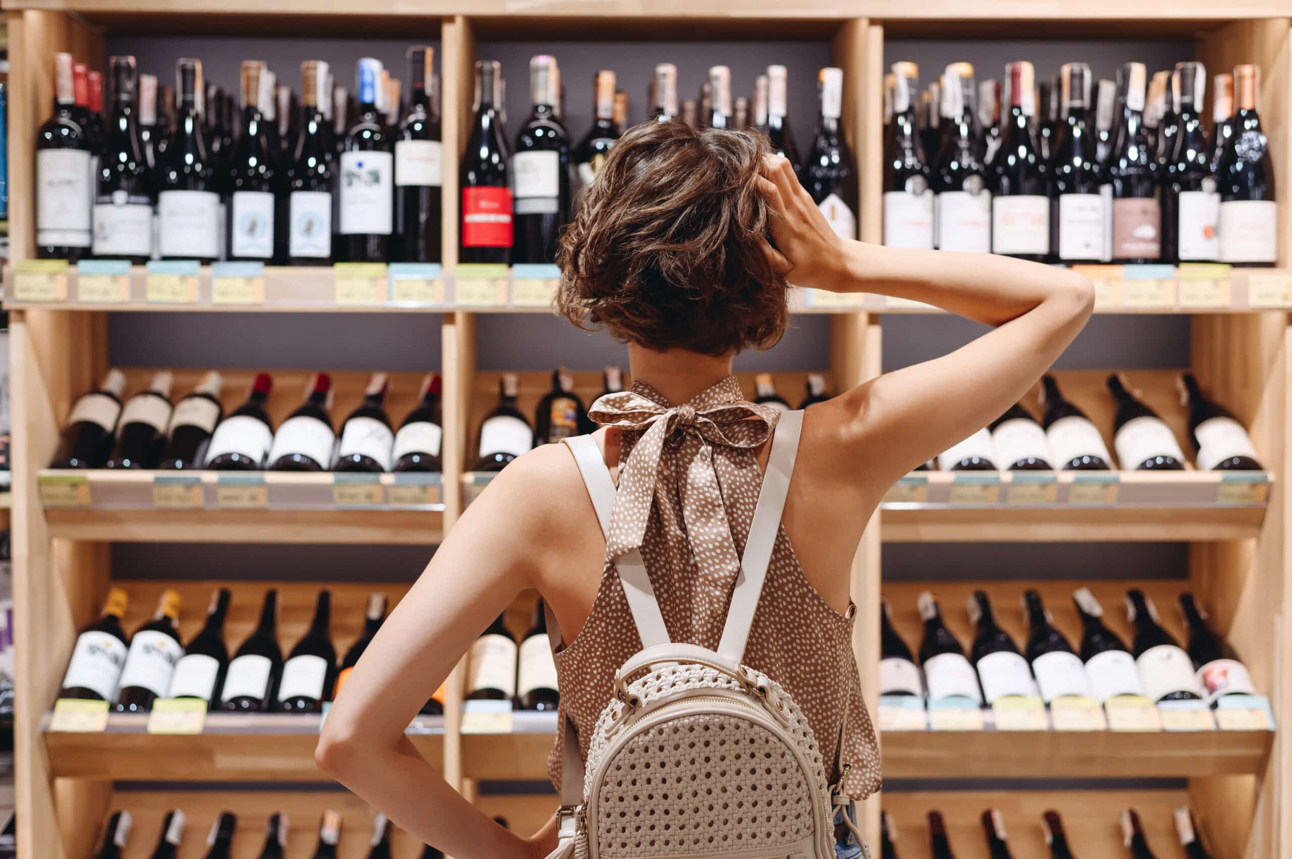
At retail customers are faced with the wine aisle of thousands of bottles. According to Nielsen, “Package design reaches 100% of likely buyers at the first moment of truth where 50-80% of purchase decisions are made.”
Even if your winery does not sell at retail, consumers are still unconsciously comparing your packaging to wine they purchase and give their friends.
With so many choices, why should someone buy your brand?
When re-designing a wine label or starting from scratch our process is the same.
First, we walk clients through defining their core customer. We do this with market research on your area, wine consumer type, and your price point. Plus, we research your competitors.
Often when I first ask clients which wine drinkers they are targeting they reply with “All wine drinkers.” The problem with that thought process is that there are actually different segments inside the wine drinking population. Some shoppers are just looking for deals and others are only looking for wines that are a certain number of points. Paying attention to who exactly your customers are, will help you create packaging that precisely target your niche.
Create a brand strategy that is different
Second step is defining how your brand is different. There are thousands of wine brands out there, so standing out is essential for your brand to be chosen.
Differentation: As Mary Neumeir of the Brand Gap says “Our brains are hardwired to notice what is different, not what is the same.”
When I talk to wine clients and speak at conferences about creating a new wine brand, one thing I always try to emphasize is making sure their brand is differentiated from other wine brands. What does this mean?
It means knowing what makes your brand different and promoting those benefits to a very specific target market.
Once you decide on your target market and how you are different try this exercise. Fill in the blanks in the below statement based on your above strategy: Only (your winery) delivers (unique differentiating benefit) to (target audience).
Once the above work is complete in our Bauerhaus Brand Map process, we create and present three design options for your brand. We include different packaging elements based on who you are targeting.
Wine Packaging Price Comparisons
To illustrate the differences between target markets and price, I am sharing a few comparisons and talking about what elements elevate each.
Not sure what elements improve your perceived value? Click here to read the the top elements.
How would your wine packaging hold up to the below examples? Are you missing elements that could increase your perceived value?
Wine Match One:
KC Wineworks $25 vs Sake Seven $200
We worked with both KC Wineworks and Seven Sake to create their packaging to appeal to their customer at their price point. KC Wineworks, located in the Crossroads District of Kansas City, primarily targets a younger audience. They have a unique gear logo, die-cut label, black foil on black textured paper. Each wine in their line is differentiated by a different colored line. They have a plain black closure at the top.
Seven Sake retails for $200 in the United States and even more in Hong Kong. Seven sake is one of the few sake’s to show both English and Japanese text. We highlighted this fact by having both Seven and the gold foil Japanese characters of equal weight. This bottle’s perceived value is higher due to the textured bottle, the embossed gold seal, and this label has a lot of negative space that implies a classic design. The paper is torn around the edges and gives the appearance of being handmade, just like this limited edition run.
 Wine Match Two:
Mark West $10 vs Jordan Winery $60
Two very well known brands with classic layouts. Both you can easily read the brand name first. Mark West has a generic grape leaf icon to draw your eye, while Jordan has a custom etching of their property. Jordan’s label style is inline with traditional French estates and their focus on food, wine and hospitality.
Both use classic fonts and different types of tiny lines in the background to give the label design some depth, similar to custom stationary. The main difference between these two package designs is the Mark West wine has the bright yellow-orange color. This color scheme is immediately recognizable as Mark West. It also signifies a lower price point of $10. If you were to line up wines in a retail store from lowest to highest priced, you will notice that many lower priced wines use a bright color scheme.
 Wine Match Three:
Barefoot $4 vs Muddy Arch $20
Barefoot Wines Moscato is one of the best selling sweet wines in the United States. The foot on the label is immediately recognizable across the different types of wine styles. Their use of a screw top is one clue that this is a lower priced wine. The basic paper, non-traditional fonts, playful design, no vintage year, and the bright color scheme are more clues this wine is $4.

Our client, Muddy Arch, by Leonard Wine Company, also uses a bright color and clear focal point, but that is where similarities end. Muddy Arch is primarily marketed to St. Louis wine drinkers, who are very proud of their Arch. Their naked closure signifies a new trend to show they aren’t a stuffy wine brand. The Muddy Arch label was created with a clear hierarchy, a thick paper with silver foil for the stars in the night sky and a drop shadow on Muddy Arch. Plus, the river is embossed, so on pick up you can run your finger over the texture.

New: Wine Label Design Reviews
We work with both start-ups and existing brands that need a re-design. For existing brands we are offering a limited time Wine Label Design Reviews for $300.
Do you have an existing label that you know needs help? Or have you heard negative comments about your labels from customers or industry professionals? We can help!
This includes a one-on-one with owner Rebecca Ritz, a questionnaire about your brand, and a one page document with suggestions to increase your perceived value. You can take this to your existing designer or we can also provide an additional estimate for wine label design.
Interested in elevating your own label designs to create more trust in your product? Schedule a discovery call with Owner Rebecca Ritz!
Want to hear more about wine label design in-person? Join Rebecca Ritz at the wine marketing conference, License to Steal, on April 24-25.